iPickleball
For this design, my focus was the Pickleball community. I chose vibrant colors reminiscent of the Pickleball court, keeping a balance between visual appeal and user-friendliness.
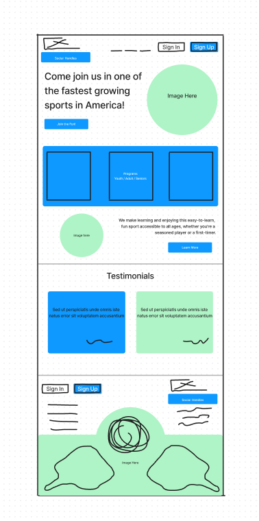
In the top section, I decided on a large image, with a fun fact regarding pickleball to draw interest, followed by the three different programs offered (youth, adult, and senior).
Then, I lead visitors to more information about Pickleball in case the visitor is still unsure in the first half of the Home page.
Finally, I decided the last half of this page would be best for laying out testimonials. If the visitors made it down here and were on the fence, they would see other members speak on how much they enjoy the activity. Below the testimonials are all of the contact information and social handles to look at.
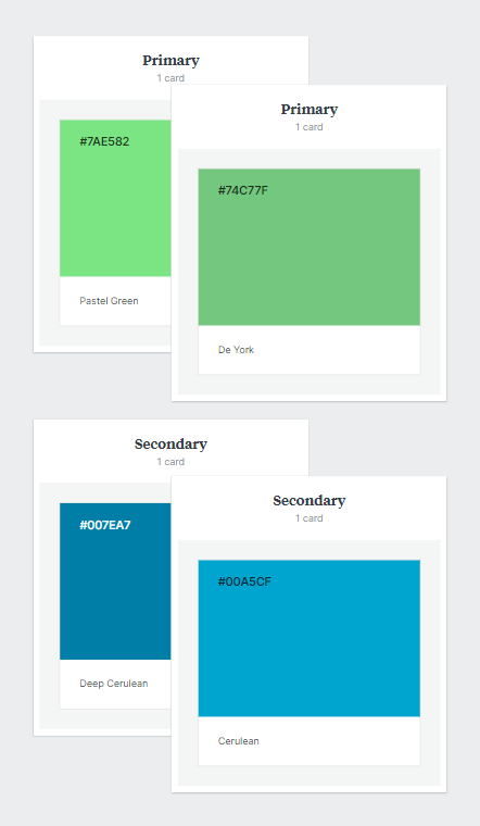
As mentioned previously, I drew inspiration from the Pickleball courts I encountered during the research phase. In the end, I settled on the following: (HTML #74C77F) (HTML #00A5CF)

I opted for the Poppins font due to its clean, legible qualities. The geometric qualities of the font complement the rounded sporty aesthetic of Pickleball.
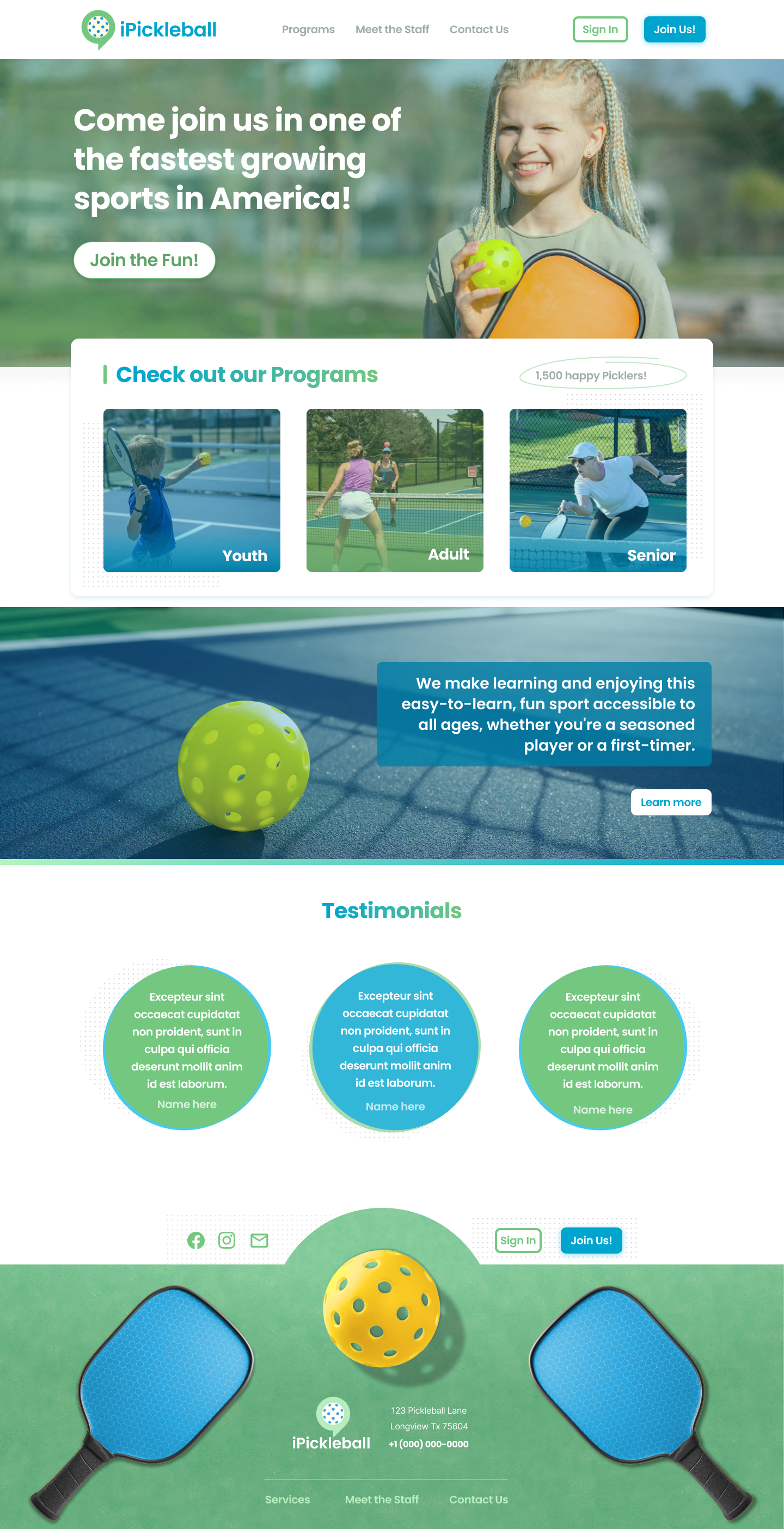
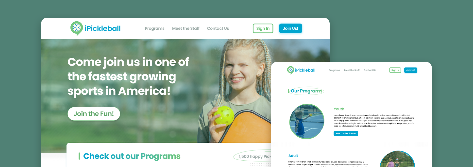
I chose a more standard website layout, offering an inviting hero section with a youthful pickleball player. I chose this photo specifically to portray that the sport is friendly for all ages. I showcased the programs that are offered above the fold so that users can access them easily.
The addition of a testimonial block at the end serves to inspire trust in new visitors, prompting them to sign up. With the footer, I opted to use two mirrored pickleball paddles with a pickleball between them. This gave me a feeling of completing a circle and tying everything back together to the sport of pickleball.
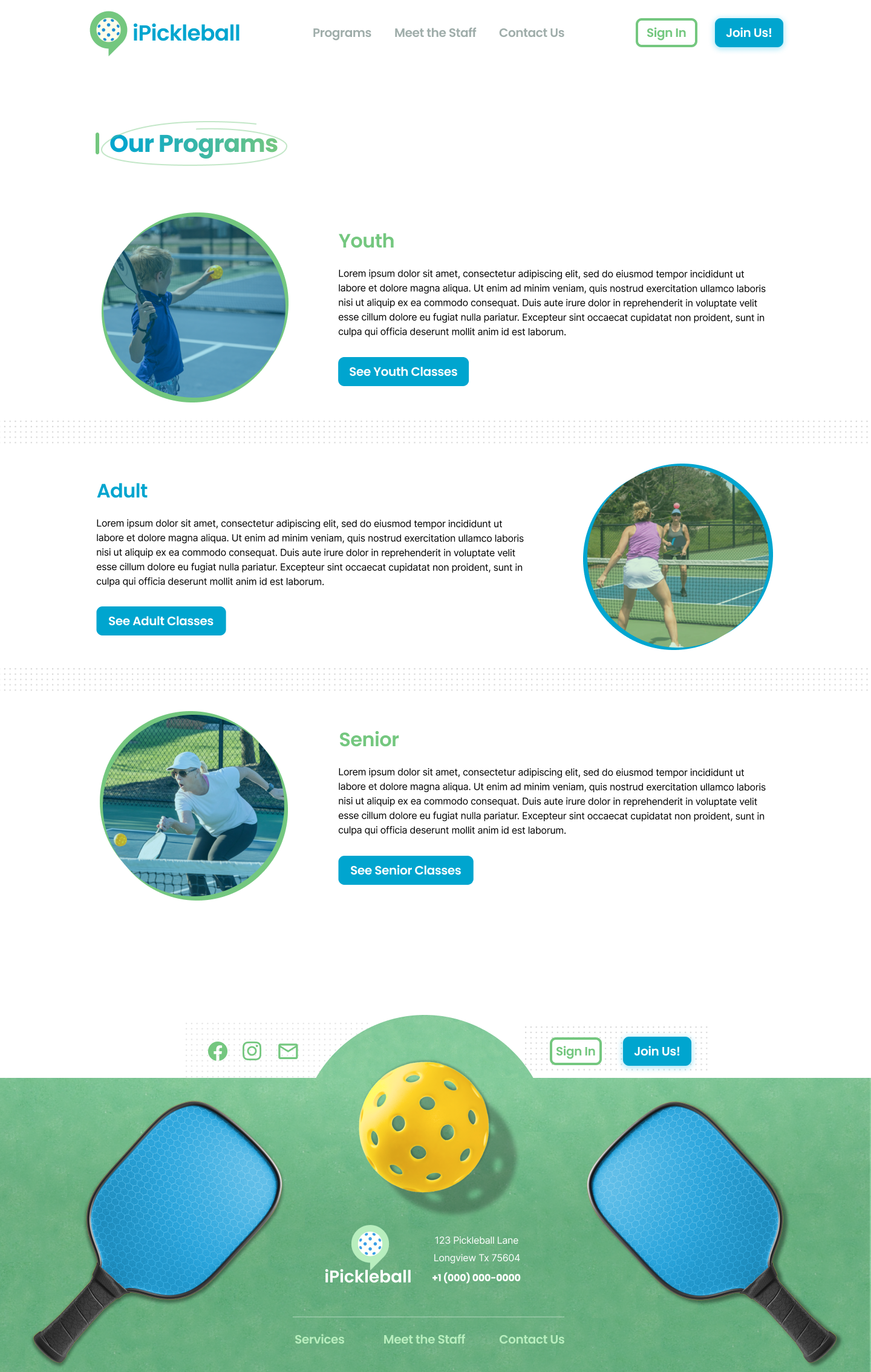
On the Programs page, I chose to use an alternating pattern (image placement) to keep the visitor engaged. Using subtle dotted dividers to break up each program's section without being too disruptive or drawing attention away from what is meant to be highlighted.
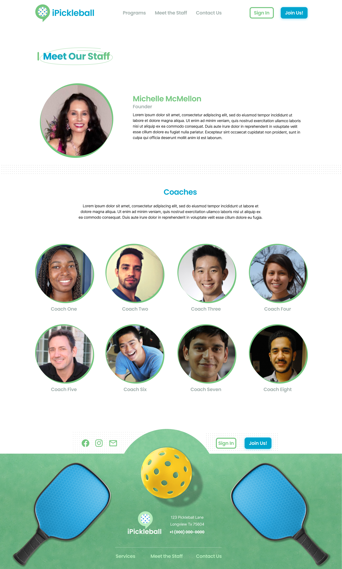
The purpose of the Staff page is to enhance transparency and facilitate a sense of connection for potential customers with the owner and coaches. Circular photos enhance the aesthetic appeal, creating a serene and inviting atmosphere.
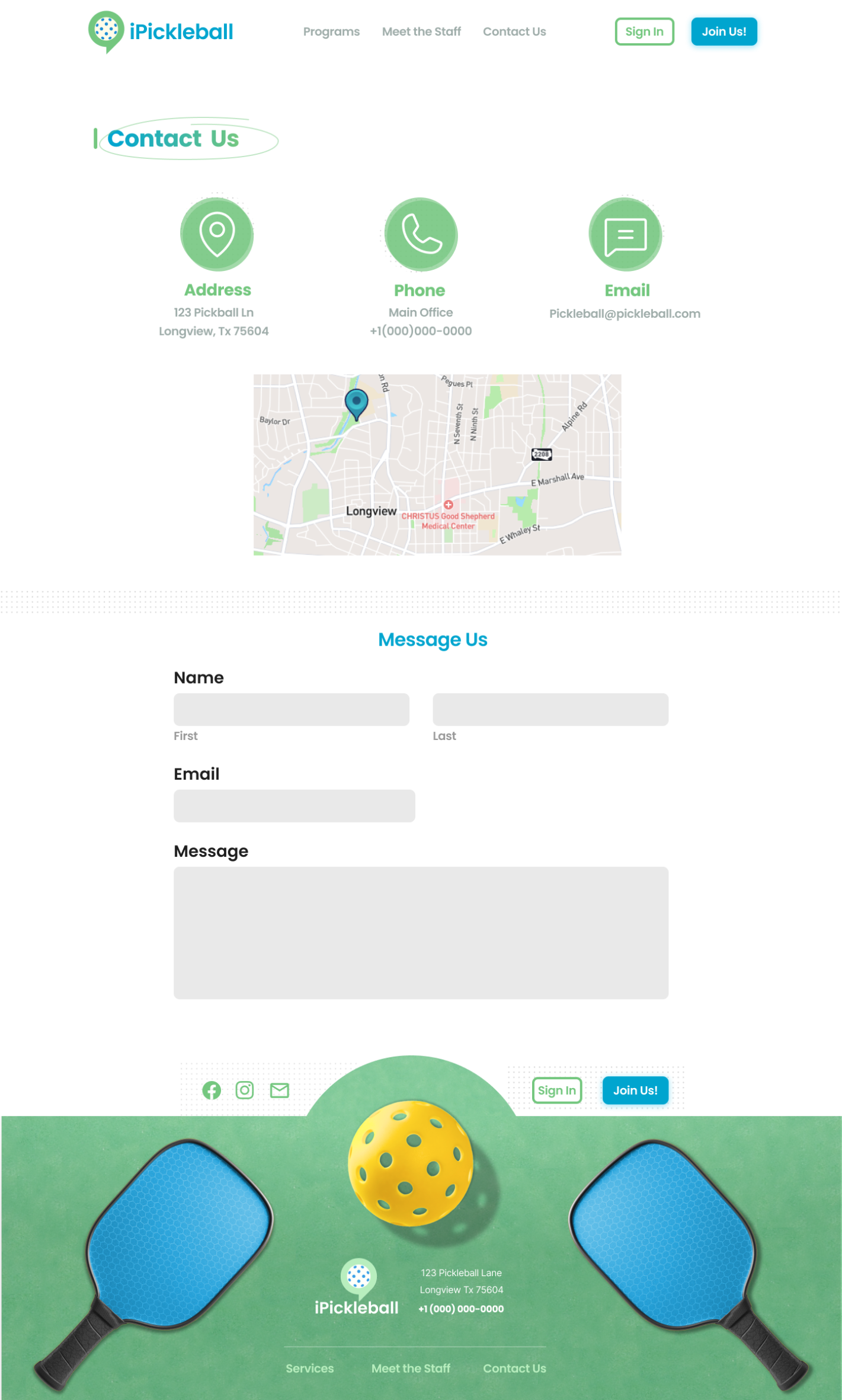
The Contact page is kept straightforward with circular icons for easy access to address, phone number, and email information. It also includes an embedded map for location and form for new leads or general questions.
Get In Touch